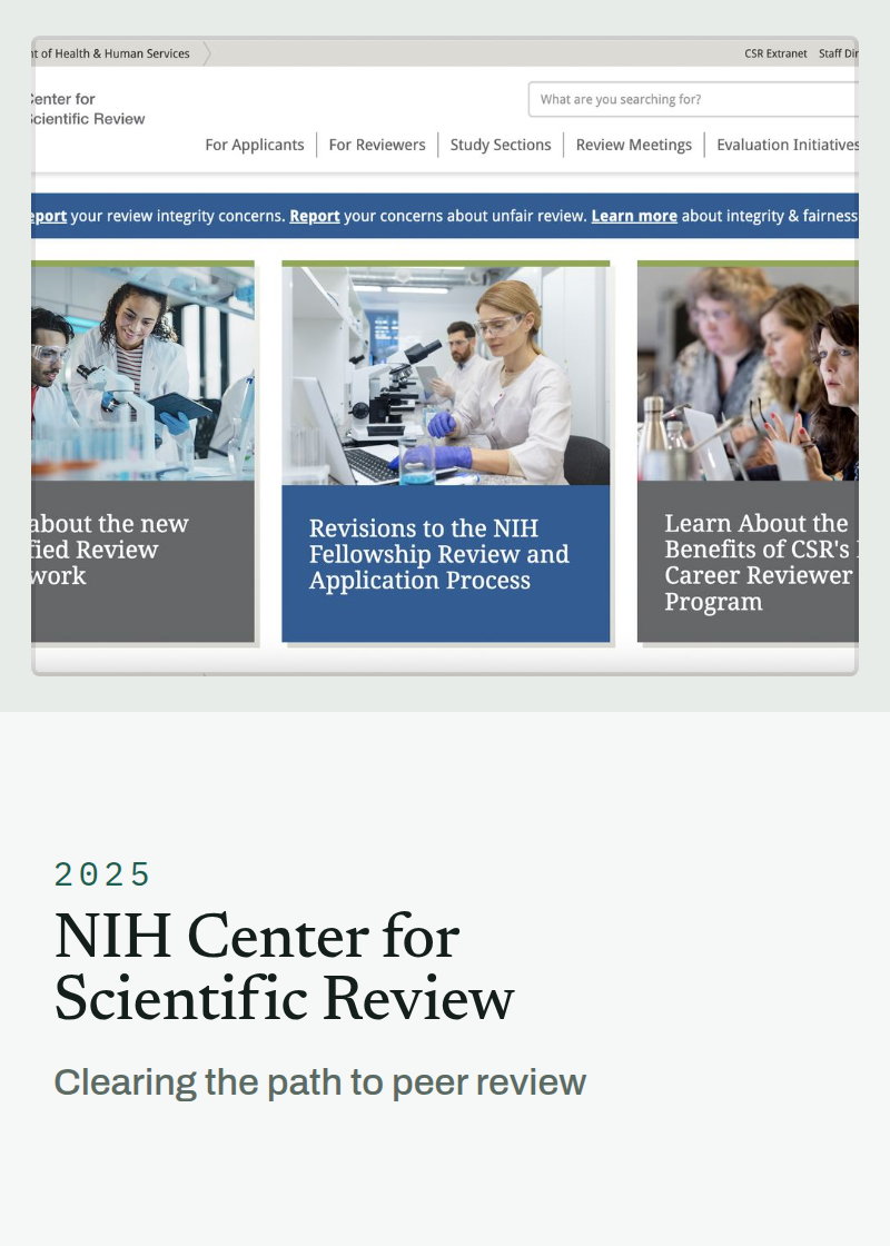
The NIH office that runs peer review for most federal biomedical grant applications needed more scientists to volunteer as reviewers. Its website already had a page for them. Almost nothing about the site made it easy to get there.
Role — Design Lead duration — 1 Year
Team — Design support, scientific review officers, communications, web development
Focus — Information architecture · research · accessibility
Team — Design support, scientific review officers, communications, web development
Focus — Information architecture · research · accessibility
Outcomes
−13% Misclick rate across participants completing the same navigation tasks.
4.3 → 5.1 Self-reported satisfaction with navigation, on a 7-point scale, before and after.
15% Fewer pages across the site, with no content removed.
What CSR Does, and Why Its Website Matters
The Center for Scientific Review receives and manages peer review for the majority of grant applications that come to the National Institutes of Health. Every application is read by a study section — a panel of working scientists who volunteer their time to judge whether research gets funded.
That system depends on a supply of qualified reviewers, and the supply is not automatic. Scientists have to hear about it, understand what the commitment involves, decide they are eligible, and find the specific program that fits their career stage. Nearly all of that happens on a website.
So the site serves two groups who want opposite things. Applicants arrive anxious and deadline-driven, looking for rules. Prospective reviewers arrive curious and uncommitted, looking for a reason to say yes.
Problem - Two Forces Arriving at Once
The reviewer pipeline was thin. CSR needed more scientists on study sections, and the website was the recruitment channel. There was a For Reviewers section, so the problem was not that the content was missing. It was that nothing about the site's structure or its most-visited page did any work to move a scientist toward it.
A modernization and compliance mandate set the clock. The site had to meet federal web standards and Section 508 accessibility requirements on a fixed timeline. That constraint turned out to be useful: it made a structural rebuild fundable instead of merely advisable.
Research - Watching People Look
The research ran from the prospective reviewer's point of view. Participants were researchers, and they were asked to move through the site as a scientist deciding whether to serve — not as an applicant, and not as someone told where to go.
Card Sorting — 12 participants. To find out how researchers group the site's content themselves, rather than how the center groups it internally.
One-on-One Interviews — 50 participants. To locate specific navigation pain points and hear the language people used for the things the site named differently.
Usability Testing — 30 participants. Task-based, measuring both misclick rate and self-reported satisfaction, run before and after on the same tasks so the two rounds were comparable.
What it showed. The site was organized around CSR's internal structure — its divisions, its announcements, its scheduling. That is a real and coherent way to organize a site, and it is invisible to everyone outside the building. The two audience paths were present but competing for attention with organizational content, and the labels used the center's vocabulary rather than the visitor's.
Change - Clear the Path That Was Already There
The redesign did not invent the audience split. It gave the split room to work — by taking organizational content out of the top level, renaming what people had misread, and putting reviewer recruitment on the page everyone actually lands on.
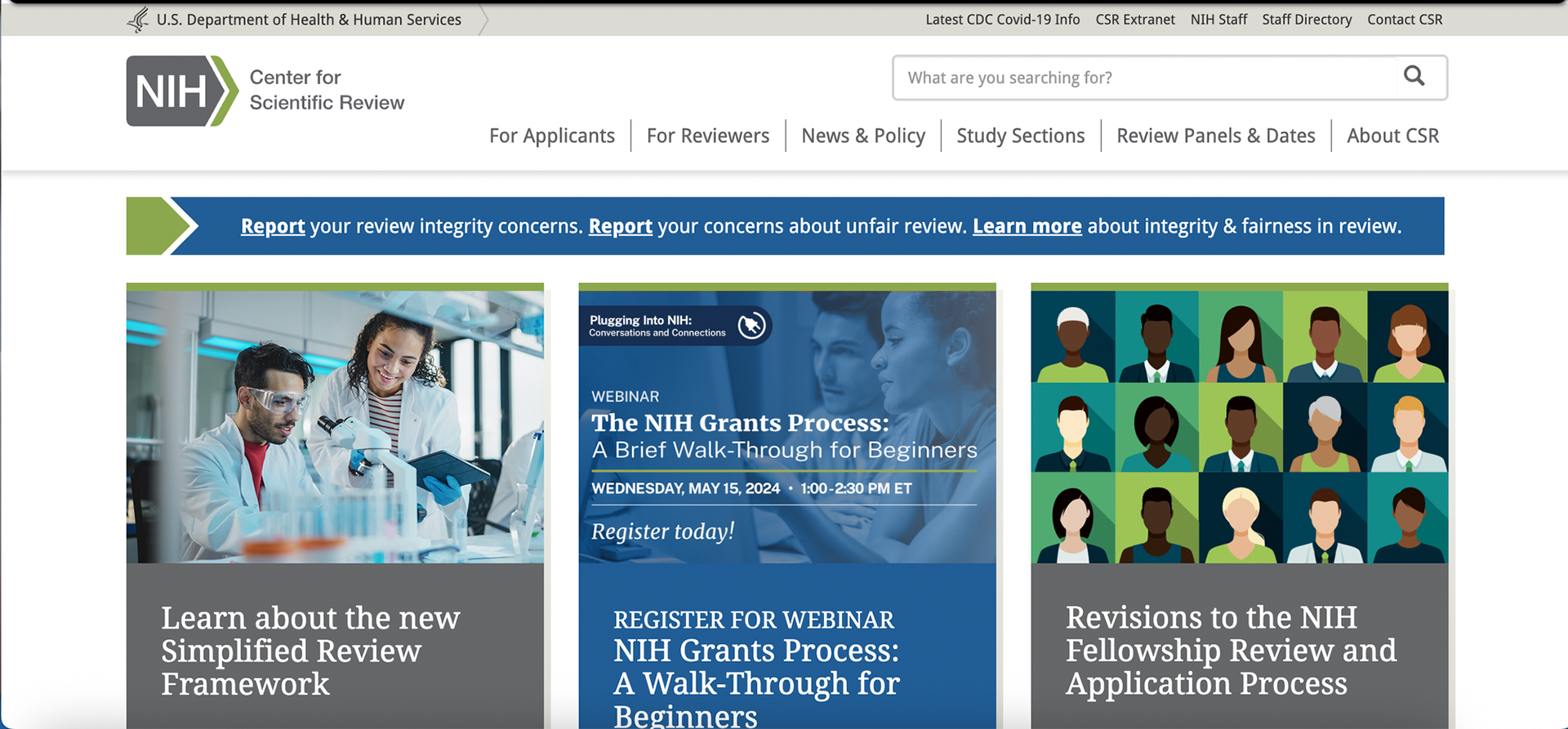
Before. Six top-level items, two of which served the organization rather than either audience. A utility bar carrying an expired COVID-19 link and internal staff destinations. Three feature cards in three different visual languages — a stock photograph, a promotional webinar graphic, an illustration — one of them advertising an event that had already passed.
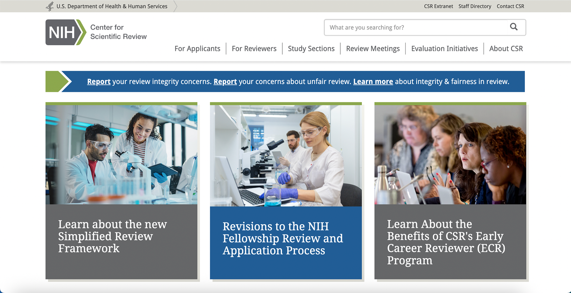
After. The same six slots, spent differently. News & Policy left the top level. Review Panels & Dates became Review Meetings. The third feature card now promotes the Early Career Reviewer program — the first rung of the reviewer pipeline, on the highest-traffic page on the site.
The Five Changes
01 — Took organizational content out of the top level: News & Policy is content the center wants to publish, not a destination a visitor sets out to reach. Both the card sort and the interviews put it low in researchers' priorities. It came out of the primary navigation and stayed on the homepage further down the scroll — visible to anyone who wants it, no longer competing with the two audience paths.
02 — Renamed labels to match how people talk: "Review Panels & Dates" describes two things at once and matches neither what people search for nor what they call it. "Review Meetings" is the phrase reviewers actually use.
03 — Gave reviewer recruitment a homepage slot: The Early Career Reviewer program is the entry point for scientists with no prior review experience — precisely the group the pipeline needed. It moved from buried to featured.
04 — Standardized imagery across pages: Three cards in three visual styles, one of them expired, read as an unmaintained site — and a site that looks unmaintained undercuts trust in the guidance underneath it. Consistent photography was the cheapest available credibility.
05 — Consolidated 15% of the site's pages: A content inventory sorted every page by the audience it actually served and surfaced a large set of near-duplicates, written for different readers at different times. No single page was wrong enough for anyone to have removed it. Merging them cut a fifth of the site without losing content.
Constraints - Designing Inside a Federal Agency
The constraints here are different from product work, and working well within them is most of the job.
Content ownership is distributed. Pages belong to the scientific review officers who know that subject matter. Consolidating pages means negotiating with the people who wrote them, not deleting them.
Section 508 is not a polish pass. Accessibility is a legal requirement, checked before launch. Contrast, heading order, focus handling, link text and table structure were design inputs from the first wireframe rather than a remediation phase at the end.
Nothing ships without review. Approval chains are long and public-facing language carries institutional weight. Decisions had to be documented and defensible, which changes how much a design can rest on taste.
One negotiation, in full. News & Policy mattered a great deal to an internal stakeholder and very little to the people in the research. Both findings were real, and neither one settles an argument on its own. The resolution was to separate the two things the stakeholder actually wanted — that the content be published, and that it be seen — from the thing the navigation was being asked to do. News and policy content stayed on the homepage, further down the scroll, where a visitor meets it while doing something else. It left the primary navigation. The stakeholder kept the visibility; the two audience paths got the room.
Research findings do not win these on their own. They give you something specific to trade with.
Results - What Changed
Thirty participants ran the same navigation tasks before and after, as researchers deciding whether to serve as reviewers. Misclicks — a click on the wrong path toward a given task — fell 13% across the group. Self-reported satisfaction with the navigation moved from 4.3 to 5.1 on a 7-point scale. The site carried a fifth fewer pages and no less content.
The misclick figure is the one worth weighing. Satisfaction records what people say about an interface; misclicks record where they actually went looking.
Reflection - What I Would Do Next
The redesign fixed a findability problem. A scientist who arrives curious can now get to the right program without knowing its name first. It did not answer the harder question underneath, which is whether a scientist who reaches that page volunteers.
That is a persuasion problem, and it needs different evidence: talking to researchers who considered reviewing and declined, and finding out what the real objection is. Time, most likely. A website cannot give anyone time, but it can be honest about the commitment much earlier than this one is.