The Challenge
Stansberry, a renowned financial research company, sought to elevate the investor experience on its Company Page. The goal was to provide investors with a more intuitive, informative, and user-friendly platform, fostering increased engagement and satisfaction. The redesign aimed to showcase Stansberry's commitment to transparency, expert insights, and user-centric design.
THE PROCESS
The process involved comprehensive user research, problem statement formulation, competitive analysis, collaboration with leadership through a card sorting exercise, site-mapping, prototyping, and a final presentation of the proposed redesign.
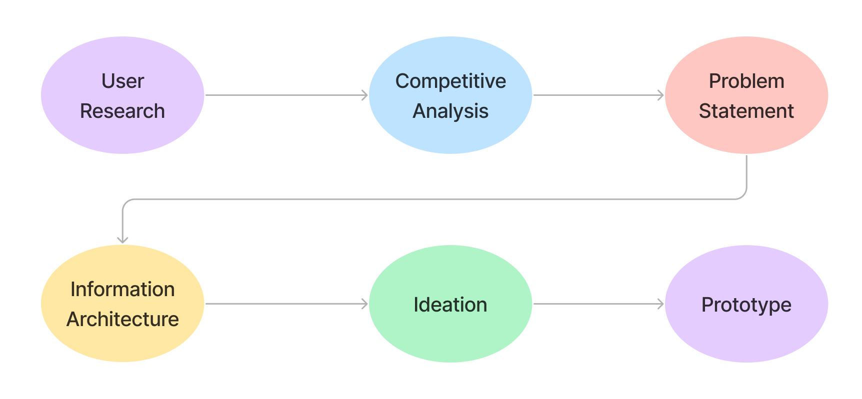
1. USER RESEARCH
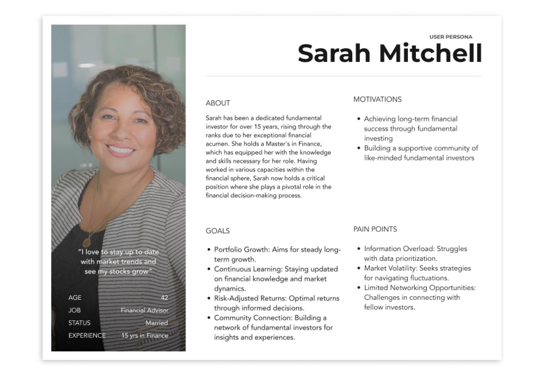
I conducted user interviews and surveys to understand investors' pain points, preferences, and expectations.
2. COMPETITIVE RESEARCH
I also analyzed competitor platforms and industry benchmarks to identify best practices.

3. PROBLEM STATEMENT
In financial investing, a clear problem statement functions as a compass, guiding investor decisions by providing focus and aligning objectives. Similar to the design process, it ensures clarity, defines goals, and aids in making informed investment decisions, fostering purpose and precision in navigating the dynamic financial landscape.
"Stansberry users are having a hard time navigating through the company page. This negatively impacts their investment decisions as they are unable to effectively sort through important data."
4. INFORMATION ARCHITECTURE
I facilitated a collaborative card sorting exercise with leadership to delve into their vision for the Company Page, aiming to align on information architecture. This strategic exercise not only engaged leadership but also provided valuable insights into their expectations. By collectively sorting and prioritizing content, we achieved a shared understanding of key priorities, laying the groundwork for a cohesive information hierarchy within the redesigned Company Page.

5. IDEATION
Now, I transitioned to translating my findings into actionable ideas. The research highlighted the need for a streamlined site flow to enhance overall navigation. I meticulously mapped the existing sitemap (pop-ups, pages, and actions). Then, I created an ideal sitemap, one that would eliminate unnecessary clicks. This strategic refinement aimed to expedite access to critical data for investors, significantly improving their experience and positioning our platform competitively.

6. PROTOTYPE
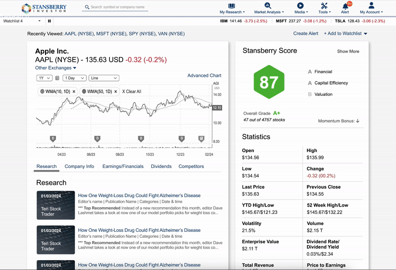
Old Company Page
Jumpy navigation, lack of hierarchy, outdated
New Company Page
Smooth navigation, clear hierarchy of information, up-to-date